Although slight quiet posting here, I’ve been really busy over the last few weeks – startup launch shizzle and then mostly taking part in Inktober. Inktober is a social media event where you create an ink drawing every day in October to a theme – a daily word prompt. Although the site says ink drawing, I’ve stretched this into ink painting, ink wash and stamps – but all keeping the ink theme. Unlike some who have been doing watercolours (really?).
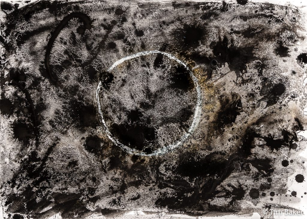
It’s actually quite hard to come up with things for this so I have had to flex different genres and media to get around some of the keywords. The first one was easy – ‘Ring’. I made a making-of video for the first time ever, to show how this was created…a lot of water! And more abstract and random than a lot of Inktober people was expecting, I err, expect! Something very black hole / cosmic about this piece – although the piece in the video was better. I had to move it before it was dry and lost a lot of ink so added some back in, I think it lost something. I love the gold though.
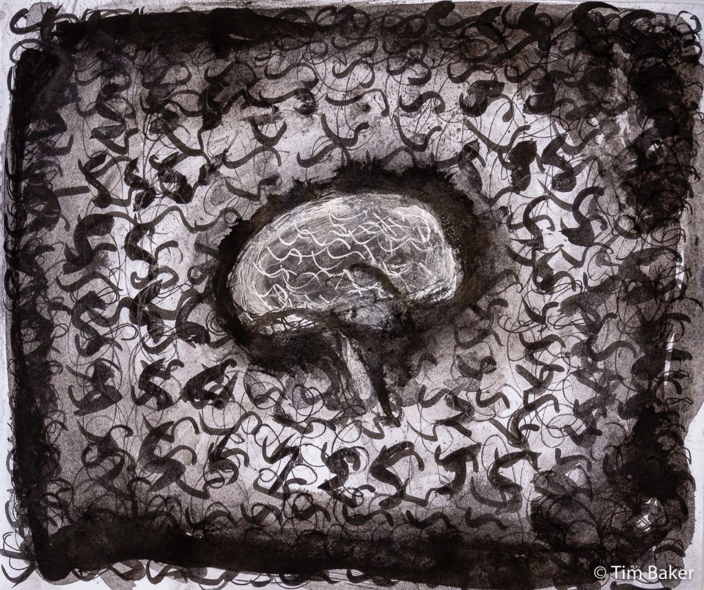
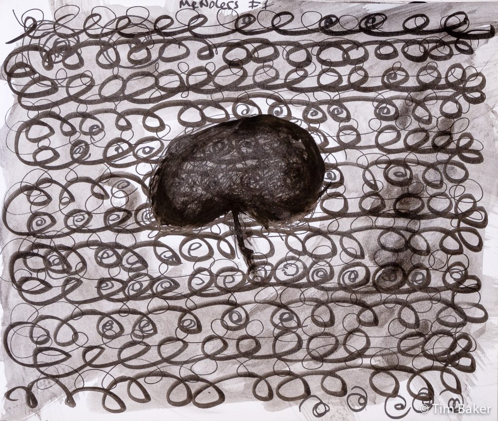
Next day’s theme was ‘Mindless’ and went with a more literal theme around doodling and also a brain – the first version I wasn’t happy with, so I created version 2 with the silver ink, as you can see here. Part of the artwork was seeing how I changed my ‘S’ spirals – very Rococo – as I repeated them…that is a shape I doodle often, S curves and spirals.
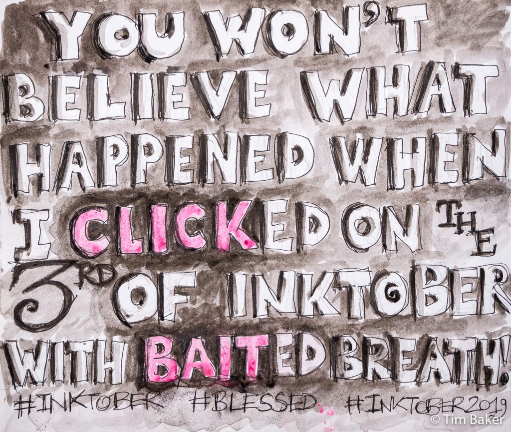
The third day was ‘Bait’ – that wasn’t a good prompt. I did a jokey cartoon about click bait, I don’t think it was successful but I want to make sure I’ve got something up every day. A cartoonist and sign-writer I am not – but again, the Bob & Roberta Smith influence – and a lot of cartoonists – is there.
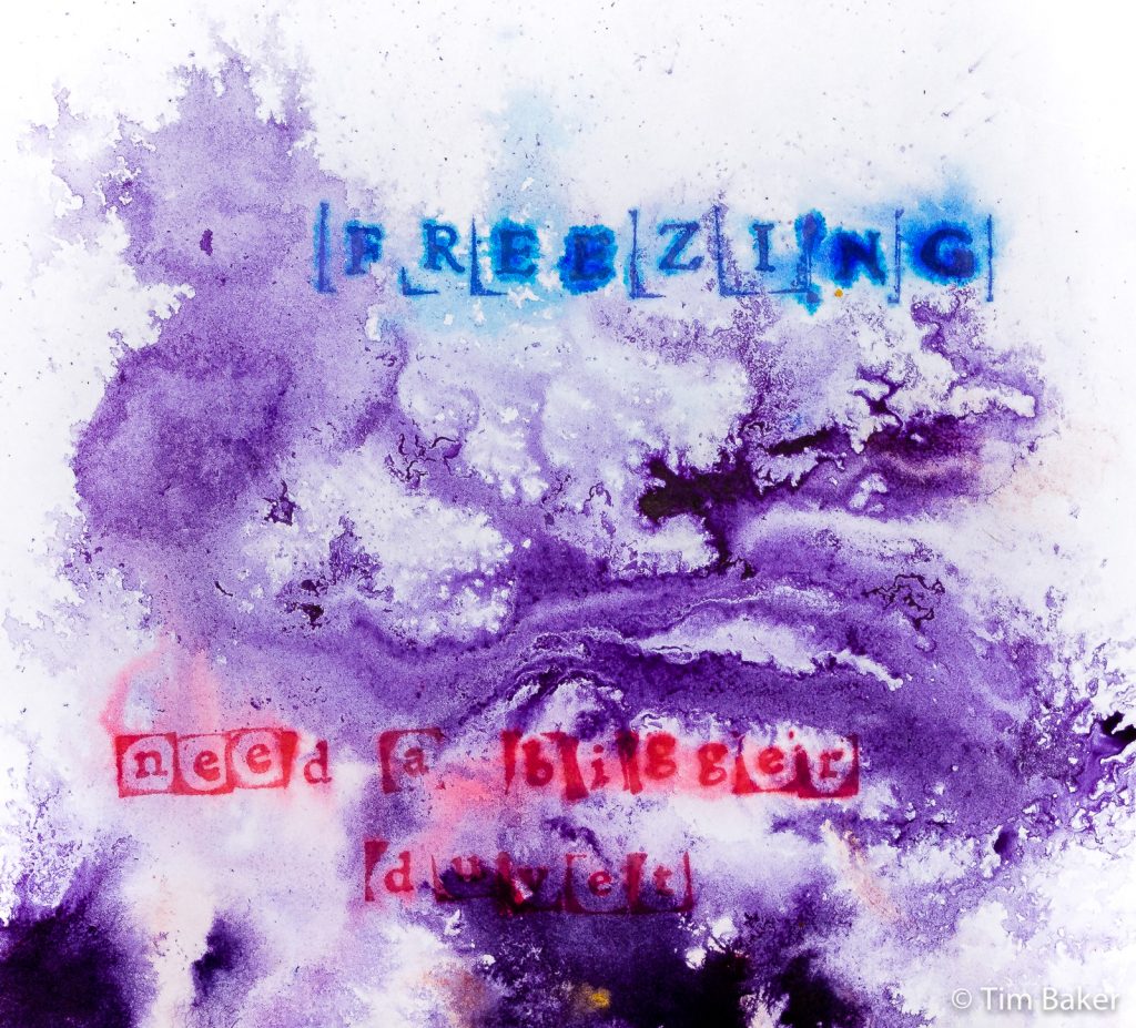
Day 4 was much better – ‘Freeze’. I’d already decided to use some stamps, and was planning to draw cracked ice in some new Dr PH Martin Bombay Inks I’d just gotten. I knew the endorsing ink wasn’t waterproof from the DIY Business Cards so used my Spectrafix fixer on it…disaster! The ink wasn’t dry or the fixer was too wet and it’s spread…
Oh, that’s in fact a really interesting effect, it’s spreading like ice – well let’s drop some of the new ink on it, it has some handy droppers after all – and see what happens. I dunno if it was the alcohol and casein in the fixer or just the ink, but you got this icy marbling fractal effect.
Job’s a good un!
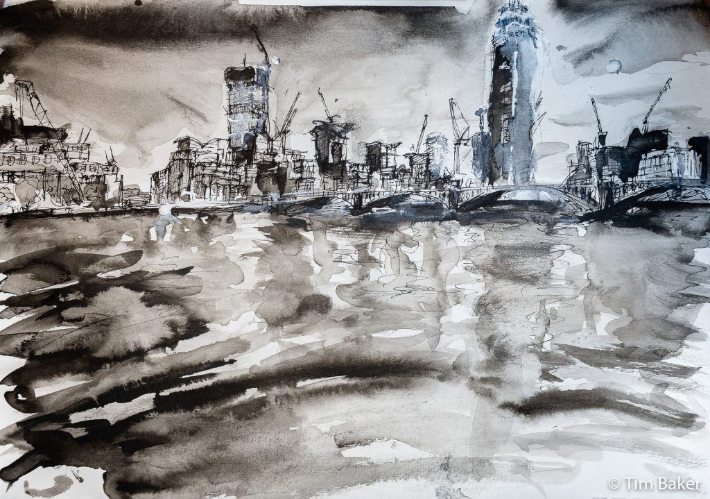
Day 5’s theme was ‘Build’ – I was a little stumped until I realised I’d taken a picture of some cranes and new buildings by Vauxhall Bridge after visiting the William Blake at Tate Britain (it’s good, although a little too heavy on the contemporaries and early work). So I did something I never do – work from a photograph. Although in this case I had seen the original landscape as well.
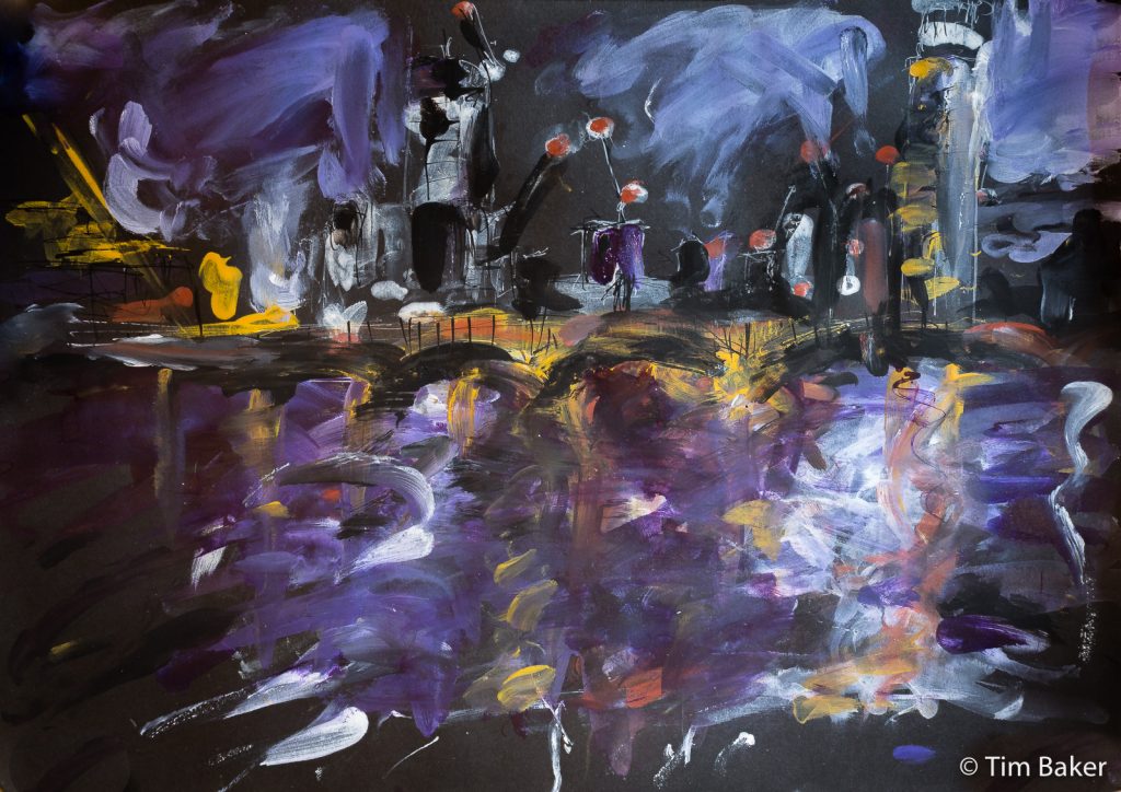
Like Day 2 there are two pieces – the first I love but didn’t really go to brief – I wanted to work on black Canford paper with my new opaque-ish inks – Dr PH Martin Bombay Inks, they are amazing and lovely to work with. So as the photo was after dusk with the lights, I did a night scene called Building London (Night).
First problem: can’t see the white ink on the Canford Card with the drawing ink nib, so changed it for a larger calligraphic one. Then dropped ink and smeared it – so just decided to go all finger-painting with it. I love the energy of this, even though it wasn’t what I was planning at all.
So I created a ‘Day’ version of Building London, on better paper – watercolour paper and just a dip pen and brush. This went much better although I do feel I overworked it / overwashed it towards the end, lost some of the highlights hence the white ink. That said, the haze and the glow of the lights DID look like that, so it’s not far off.
This video was sped up from over a hour and a half of video. My poor computer! I also forget to set it to 25 frames a second, so it ended up with LARGE files. Oops. Also I need to work out how to switch off the autofocus. And the first video I was working on the floor with my photo tripod – and later got an adapter for my desk mic stand so I could use that. It works well, but it does wobble…
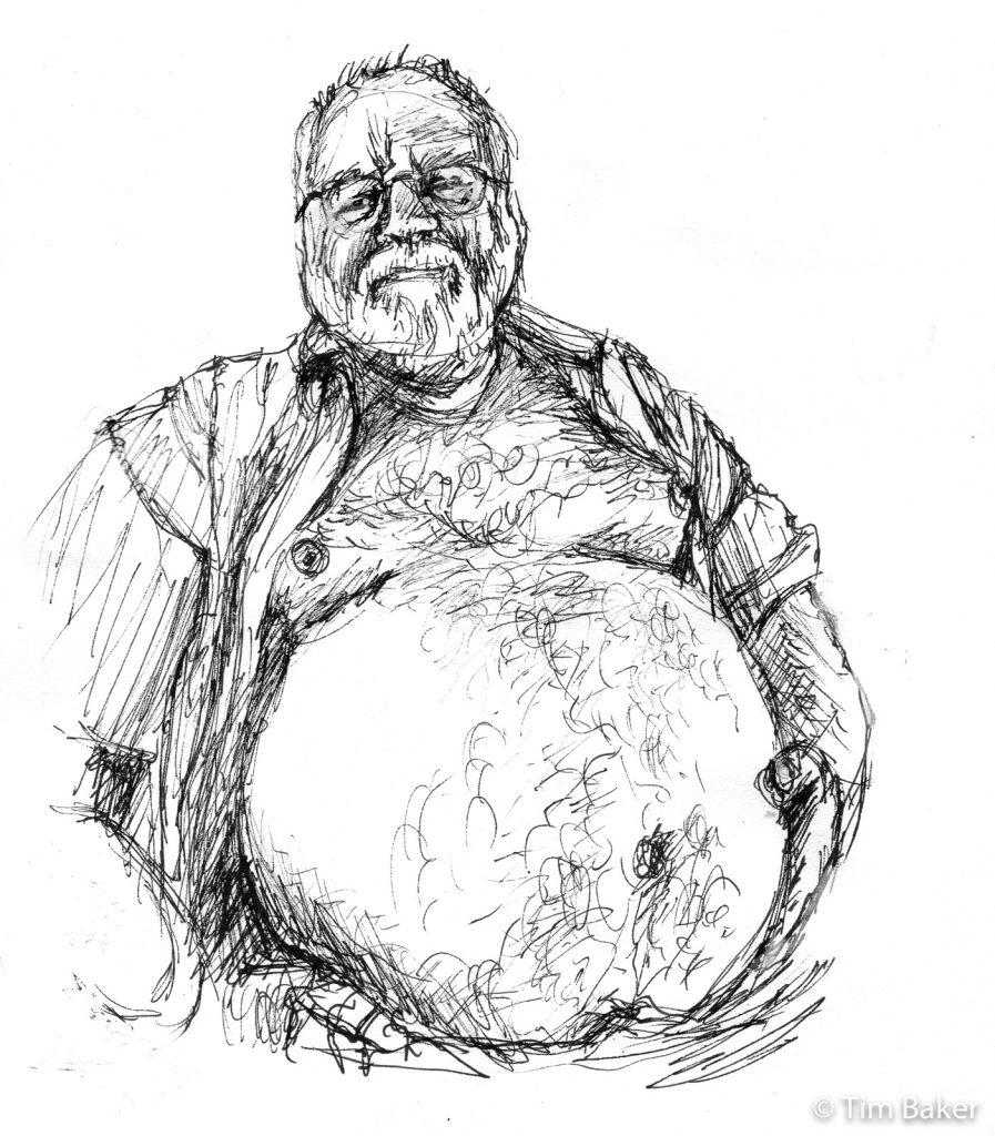
Day 6 was ‘Husky’ – so many dogs are currently on Instagram it’s like Battersea Dogs Home! But to me husky says bear, a gay bear, furry, wearing plaid. So again I copied a photo I found on the Internets for my, err, perusal. (He’s cute!). Just a Pigma Micron drawing, like the old days. I screwed up the eyes slightly so corrected them with white ink, and also tippexed the other hand out – due to the smartphone wide eye lens, there was so much distortion that it looked like some freakish monster hand! Same to some extent with his belly, I checked the proportions, they are correct.
I don’t usually do work like this, there are a lot of erotic and gay male ‘bear’ artists out there or people who do stuff for profile sites. Part of the reason for my hesitance in starting life drawing again was the fact that if I mentioned I was an artist and they knew I was queer the next question/assumption was I did male erotic art. I’m not opposed to men with their clothes off, far from it…but like the fact I am an artist not a ‘queer artist’, I am really not that kind of artist. I appreciate the skill, but I like doing other things than replicating porn poses and ‘plumber has dropped his wrench’ cheese.
Today was Day 7 and the theme was ‘Enchanted’. Like Bait I dreaded this as I just knew the obvious deluge of wizards, princesses, Disney castles and magic sparkles would envelop Instagram (I checked earlier – I was right). So as usual wanting to do something different, and not feeling ‘enchanted’ by anything at all least of all this theme, I decided to focus on what makes other people enchanted, like in a spell. Smartphones is the modern answer – those zombie-making devices that magically glow and destroy most conversation and ability to walk down a street without bumping into people.
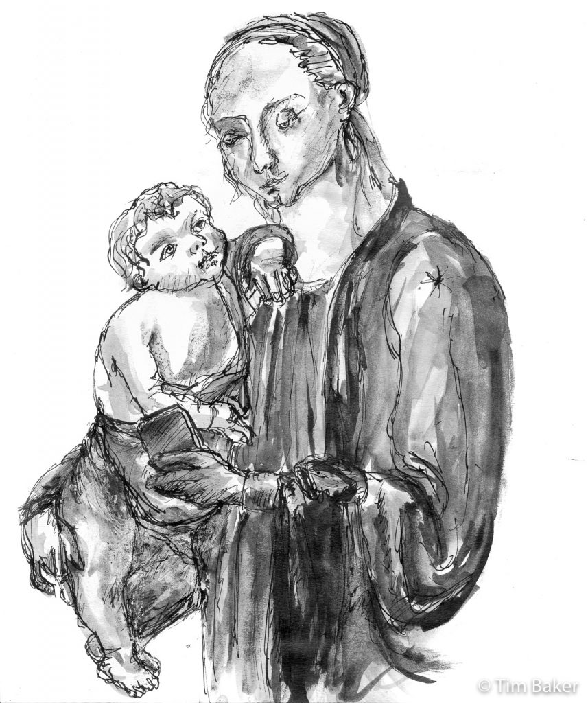
So I decided to take an Old Master painting of Madonna & Child – in this case one by Sandro Botticelli and spin it for the modern age – a mother ignoring her child so she can play Candy Crush. Or text her mates how much she hates motherhood cos the baby is so massive and heavy (really Sandro, isn’t that baby a monster size?). I did it in Ye Olde Dip Pen with Indian Ink, and of course wash. It is hard to be Botticelli for a day, but I think of this totally insane idea of trying to replicate a master in drawing paid off fairly well.
All in all, a great week and some great responses on Facebook and my Instagram. I’ve learned a lot (I am not a sign-writer nor cartoonist, eyes can be a nightmare and wet ink dries really slowly and I am not an Old Master, not even close…I already knew my hands could be way better). I’m just glad I survived Week 1 of Ink Bootcamp. Onto Week 2 – where the wonderful words are Frail, Swing, Pattern, Snow, Dragon, Ash, Overgrown and Legend (!).
Uh can we drop the Tolkein themes please?


Leave a Comment! Be nice….