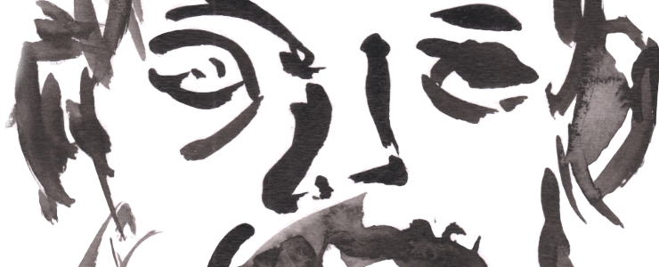


For my 20th Portraits at the Pub we had another PATP model that like Rick we had just before the first Lockdown – Jules! As before I started with ink drawings in the A4 sketchbook, including a post that was the mirror of last time but drawn far better! I was using the Evergood french flex vintage pen, a recent purchase and refurb – only £17 on eBay, fixed by myself with a new ink sac fitted. It’s a quirky pen but a good one, if very different from Mabie Todd Swans and Waterman flex.

Jules. Portraits At The Pub 20, Evergood vintage fountain pen and wash, A4 sketchbook. 
Jules. Portraits At The Pub 20, Evergood vintage fountain pen and wash, A4 sketchbook.
Another new thing I was experimenting with was tempera paint sticks – these are meant for kids but far too good for them! I was using KingArt ones which allegedly are lightsafe and ArtNews says they are the best ones. I knew none of this when I picked them up at TKMaxx on spec, and will have fun finding more when these run out. In fact I immediately went back the next day and picked up the larger box. They are that good.

The strange thing is they are like large lipsticks, but aren’t waxy nor flat when you draw with them and they dry in 90 seconds – so I have to be fast with my sgraffito! They dry flat, matte and really look more like markers or ink, especially as they are half opaque. This makes them look like a hybrid of markers or oil pastels but a lot cleaner and convenient to use with REALLY bright colours. I didn’t add any saturation to these scans, this is how they look!

Great for abstract work, but I thought I’d try portraits with them – and they came out great. I am experimenting with colour theory – contrasting colours to darken or brighten them. But these two remind me a lot of my life drawings of old, especially the ones of Sarita. It really is a return to my graffiti/marker past, and I have been using them with landscapes trying to bring a painterly/abstract/fauvist feel to my work. Certainly the hyperbright colours – including neons and metallics – means I have to really push my colour theory application.
I love laying the red over the green or pink over green or scratching away the blue over yellow – they really do look like I’ve been printing or doing linocuts sometimes, but without the faff or mess of those. They are allegedly lightsafe but I am really sceptical about the neon or metallic ones being lightsafe. Even the basic ones I do wonder given the brightness and cheapness of them – it really looks more like dyes. But the company says they are lightsafe, so I have to go with that until I test them when the sunshine has come back!
Leave a Comment! Be nice….