
It got too late to travel anywhere one day last week and I decided to take a chair out into the street and draw and paint where I live…this caused quite a lot of interest from passers-by. It’s a good way to meet people! The piece below I did last, ‘Our house, in the middle of our …’ which is a Madness lyric (how can it be in the middle of the street? Don’t cars drive through it?). The intention was to feature more of the pollards but that didn’t happen, and I did the masking of the light areas first then did a loose watercolour over the top.
Not exactly sure why the buildings seem to be collapsing, but someone came up and said they liked it even before the masking came off! It’s like the houses are melting, it’s very trippy.

I’ve decided to call this the ‘Negative Space’ series, since that’s really what it’s about, working in reverse to my usual method, working with white space first and darker spaces later.

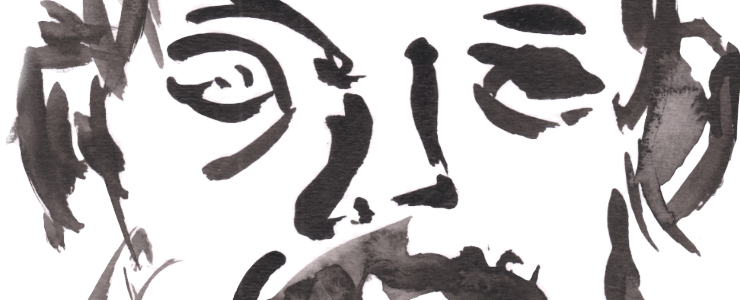
I did the quill drawing ‘Maple Pollards (Those Useless Trees)’ with lashings and lashings of water. Obviously the subtitle is a lyric from a Pulp song, I don’t think they are useless but the council seems to think so the way it brutally pollards them back. They are now growing and whereas before they looked like naked alien creatures, they now look like cheerleaders or poodles, with fluffy green pom poms at the end of each branch. The birds are happier with the leaf cover anyway.
The intention was to do watercolour with the quill drawing, but I realised it would run together – which can look good – and I felt it was fine as a drawing. I rarely leave ink drawings as they are, it’s good to not always do mixed media or add more sometimes. I feel it’s the more successful of the two.
A bugger to photograph, though. The thicker parts of Indian Ink are shiny but reflected enough light in the photo to come out grey…hence spending a lot of time darkening those bits down again. Oh for an A3 scanner!
Leave a Comment! Be nice….