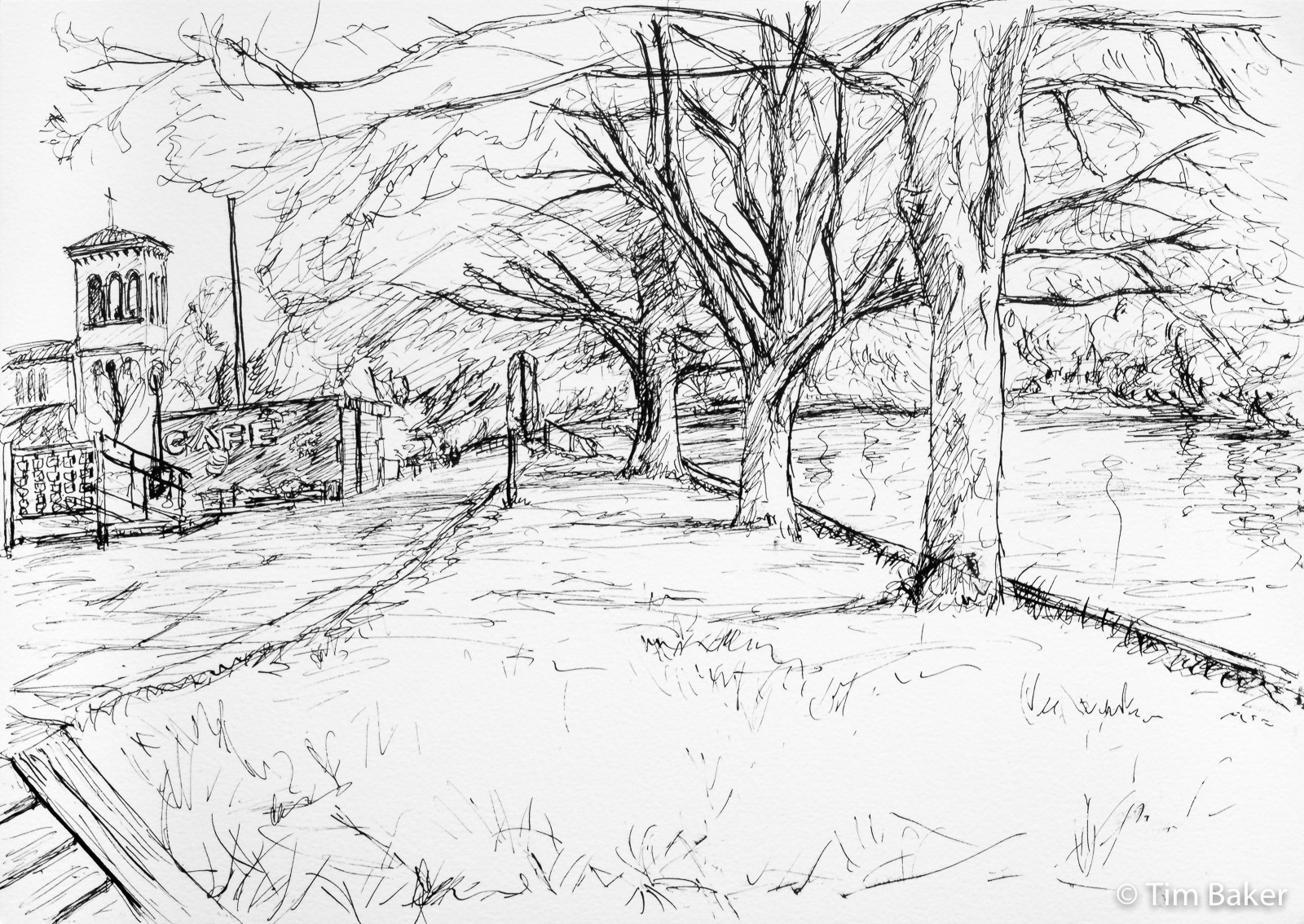
Sounds like a film ‘On The Promenade’ – an arty French black and white flick, bit like ‘On The Waterfront’ but more, well, French. Sort of tying in with that thought is ‘Japonisme’ – the influence of Japanese art on European and particularly French art with these ink drawings. Not sure what the type of tree that is on Queen’s Promenade, but it is an oriental species I think, I love the drooping curved branches. Just like my obsession with willows! I also used the spread of the ink to denote the few budding shoots.
The title comes from the song originally by T-Bone Walker, but one I heard recently via Eva Cassidy, an artist I hitherto avoided due to her post-humous Radio 2 associations, but a brilliant cover. It was a stormy grey day, very broody yet I cannot remember the day, so the lyrics seemed to fit my mood perfectly.

They call it stormy Monday
T-Bone Walker – Stormy Monday
But Tuesday’s just as bad
Yes, they call it stormy Monday
But Tuesday’s just as bad
Wednesday’s worse
And Thursday’s also sad

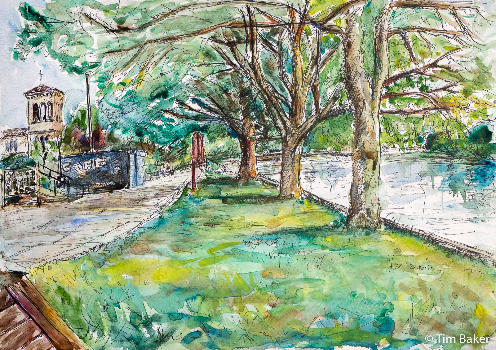
A very different piece is this ink/watercolour piece of the Promenade – at the closed Ginger Bees cafe, and St Raphael’s in the background. I drew the view one day, ran out of time and was planing to leave it as a drawing. But it nagged me it wasn’t finished, so I went out a few times to try and do the watercolour part. Usually the decking sitting area was full, until one day it was empty.
I continued even though a noisy set of skater kids arrived behind me – they didn’t bother or come close to me so I battled on regardless. Given what I now know about proximity and time with the virus, I’d have moved because even outside with social distancing, spending long periods near people is risky as even breathing, singing or shouting emits the virus. Not as bad as with still air inside, but still worth avoiding. I kept my back to them anyway.


This is an exercise in using raw umber. I’ve previously shunned raw umber as a pointless palette addition (I had it in my original Winsor & Newton field box, still have part of that pan because I never used it). Now I can see why I struggled to get the greenish-brown gold-yellow tones in the plane trees in the past…although you can dull down burnt sienna with blue or crimson it never seemed to look right. The secret is a greenish-brown like raw umber.
Now the one I really don’t get is burnt umber, I bought some Ken Bromley to test and it’s so close to Burnt Sienna, a warm mid shade between burnt sienna and raw umber and I’m not really sure what the point is. Certainly I’d avoid having both ‘burnt’ types – or indeed raw AND burnt umber unless you have a specific need for both. Overkill (like all colours, it’s good to have a warm and cool one – brown is the exception cos you want yellow ochre as well).
Maybe it’s because I have and use indian aka venetian red in my portrait works, which fills the place of that reddish-brown. Indian Red like umber and ochre goes back to cave-paintings, mud basically but very permanent mud or clay. It is basically iron oxide in earth, aka ‘red earth’, and quite an extremely powerful colour with a high-tinting strength. A little goes a long way….


Leave a Comment! Be nice….