
Since I last visited the Filter Beds, I’ve sold the Moon piece – thanks Linda, it’s off to it’s new home, and a lot has happened….July feels like years ago! But despite still banning the river it’s allowed as a subject and I wander by there regularly. There has been concern locally about the Filter Beds via SWAG – the Seething Wells Action Group. The place has been abandoned since the early 90’s and is basically an edge-lands nature reserve, but the company that owns it has been clearing the site and spraying weedkiller, pulling down fences and structures and removing trees and bushes.
Given they aren’t getting planning permission any day soon, it’s all very odd…and they aren’t securing the Filter Beds site at all.

First up is an example of that lack of security – I was creating this Parallel Pen and Ink and brush piece ‘The Bicyclists’ when some kids on bikes went by and gave me the stink eye. A bit later I realised why when the same kids were cycling around the Filter Beds site, along the thin banks separating the beds like daredevils, pulling wheelies along them.
So of course I added them in and called it ‘The Bicyclists’. Still have no idea how they got in, I suspect they lifted their bikes over the low-ish fence. This is layered from different Rohrer & Klingner Sketchinks and De Atramentis Yellow Document Ink.
The most recent piece of this lot is this one I did last week or so in my A5 etchr sketchbook of the temple-like building that still sits on the site – it was featured in one of my early-ish watercolours and the piece is a sequel to Danger Deep Water 1, a night piece that I still haven’t finished. Those old yellow signs are all around the site.

This was an experiment in using a reduced palette of 6 watercolours, primaries and secondaries inspired by this post and wanting to learn more practical colour theory like I have with the four Parallel Pens, building up colour from just those.
At that point it was Winsor & Newton French Ultramarine, W&N Transparent Yellow, W&N Permanent Alizarin Crimson, Rembrandt Manganese Violet, Lukas Cadmium Red Light (orange basically) and a Phthalo Green – either Rembrandt Phthalo Green Yellow or White Nights Green Light. All in a tiny sweet tin I can carry anywhere!
I’ll detail it more in a future post – you can see Mark 2 in action here – I’m planning about all my gear and equipment hacks but all I’ll say now is Radiator Enamel spray – great for DIY palettes.
Anyway, what I found in practice using these 6 colours is mixing browns is hard.
When you have more time, it’s fine…but for urban work, standing up…you can’t wait to mix it all! Mixing Blacks and greys are easy – Burnt Sienna and Ultramarine is my go-to but Crimson and Green is a good alternative and deeper. But that shade of yellow/brown brick and there being many types of yellows and browns revealed how limited and samey and dull it can look with one yellow. Yes you can get those shades from combinations of Crimson, Cad Orange, Yellow, and Violet, but lack of purity in pigments means it won’t be as bright as a single pigment.
But it’s nice to prove I only need one of these little boxies to create a painting.
As you might have guessed, I am moving away from Winsor & Newton and using more paints from Royal Talens, Lukas, Daniel Smith, White Nights, Jackson’s own brand, Sennelier and Schmincke. Partly cost – W&N without special offers can be more expensive than even Daniel Smith, but partly that some of their pigments are weird colours or do weird things – the orange Burnt Sienna for instance, or the aforementioned gloopy ochre…In some cases like French Ultramarine I have come back to W&N, but most of the time I have found something cheaper and usually better elsewhere, especially cobalts and cadmiums, browns, various yellows and purples.
Really impressed with RT’s Rembrandt and Jackson’s own make – the latter isn’t always great but worth trying for their single pigments colours.

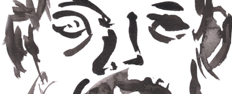
And finally after all that pigment chat, we have a drawing I’m very proud of, looking through the fence by the main entrance at dusk. Kuretake brush pens, or any brush pen can be a mixed bag for me when it comes to drawing, I can feel the lines are too thick or heavy or struggle getting a fine line. It is very much a mood thing, but when it works well, it is magical and lyrical. Click to make it larger, the detail is worth seeing.
Leave a Comment! Be nice….