
This highlights roundup has been much delayed, although I have been busy drawing with new pens, new ink and new pads. I’ve been continuing to use the FPR Himalaya v2 Ultraflex for months and loved it, but found it does railroad quite a lot with R&K Sketchink especially when flexing, and my unique FPR ink converter blocked – which I fixed by converting it to an eyedropper pen where all the ink is stored in the pen itself. They sent another which is great service, because I flushed and flushed and couldn’t budge it.
(Railroading is a fountain pen term for when the pen nib or feed doesn’t put enough ink on the page, leaving two thin lines, like a rail track)

So I got a new little Kaweco Ice Sport – again turned into an eyedropper, a cheap little German pen with a design dating back to the 30’s, which is very smooth if rather fine for my liking. Although found that using a new ink, R&K’s Permanent Black 700 Dokument ink, which is the only ink I know of that is lightfast to ISO standard, flows much better than their Sketchink Lotte does – and looks a lot blacker in thinner lines.

I also got a double broad BB nib, and a 1.5mm calligraphic italic nib, both of which I had to modify for ‘baby’s bottom’. That’s another FP term for an over-polished nib that looks like a baby’s bottom apparently. Not that I’d know what a baby’s bottom looks like, surely it’s just ‘bottom’? Anyway I had to sand them flatter, and they now seem to startup immediately.
I did a lot of two panel drawings with my A4 Seawhite which although very battered now I’m still loving…the perfect size for landscapes, even so in panorama mode! Hard to scan both sides though…and I wish I had some way of showing them as one spread in the lightbox – this will have to do:

Simply Having A Wild Thyme (first panel) , 5PM Challenge 95, Fountain Pen and Wash, 2xA4 sketchbook. 
Simply Having A Wild Thyme (second panel) , 5PM Challenge 95, Fountain Pen and Wash, 2xA4 sketchbook.
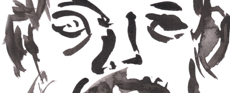
Another new pen is the Pentel Parallel Pen, a calligraphic pen with a new sort of nib, more like a square bit of metal, but really fun to use and I’m liking the thick/thin approach! The tree study ‘Stormy Weather’ which shows my Japanese influences below using this pen was a bit of a ‘mare after the fact. I had a bit of a sketchbook disaster in the rain with the Pentel ink cos the ink isn’t waterproof unlike my other inks, so I converted it to an eyedropper pen. This means you fill it with pipette.

I mixed my own version of Blue/Black ink as I liked that colour with blue Marlene Sketchink mixed into Lotte, the black. As seen below in the drawing of Achelous, but I hadn’t got the shade right yet! Too blue. Hence adding a little black from the Kaweco.

Talking of the Kaweco Sport, my first drawing with this pen, taking a pen for a walk was this abstract. It is a fun pen, and so tiny when put away – the lid actually forms part of the body! I have realised recently. I don’t take a line for a walk like Paul Klee famously said, I take a line for a dance!

There has been a lot of rain and gloom recently – not just the lockdown, the weather has been mardy too. These two are on adjacent pages and really a set, drawn as I sheltered in the rain at Queen’s Promenade in a set back bit. The quote from the first one about the sign is from Woody Guthrie’s ‘My Land Is Your Land’ which I was listening to the Sharon Jones & The Dap-Kings version, but in these enclosed lockdown and BLM era, it’s very timely:
As I was walkin’ – I saw a sign there
And that sign said “No trespassin’”
But on the other side …. it didn’t say nothin!
Now that side was made for you and me!

That side was made for you and me, 5PM Challenge 93, Fountain Pen and wash on A5 pad.
Benched (Rainy Day), 5PM Challenge 91, Fountain Pen and Wash, A5 sketchbook
I mentioned new pads at the top – well I splashed out on some new watercolour pads from Etchr Labs – just the basic ones. Thank you middle class people who moaned about Universal Credit! Not something I could usually afford but have wanted for actual years – a decent 100% cotton watercolour sketchbook. And in fact if you look at the prices of the rivals, that’s cheap! It took a fair few weeks to arrive though…
The first work with it was the tiny A6 pad ink and watercolour of Clattern Bridge – I did the other side earlier in this series. Wasn’t sure of this one, it’s good but not my best. Oddly I seemed to work up gradually to the best one via size, as the next one in the A5 etchr pad was better, another panoramic spread but I don’t really like the other side…and then the A4 one, which one half is the featured image on this roundup is best.


River View (first panel) , 5PM Challenge 99, Fountain Pen and Watercolour, A4 @etchr_lab pad 
River View (second panel) , 5PM Challenge 99, Fountain Pen and Watercolour, A4 @etchr_lab pad
I also tried my usual wet style on it, it went OK, a little muddy in places… The cotton paper does stand up to this sort of abuse. Yes that is the modern house over the river that features a lot in my work.


Also a nice piece from Canbury Gardens, intentionally reflecting one of my early pieces. How far I have come!
And finally a piece featuring people – yes people, what it wrong with me? But really an excuse to paint the tree and the barge ‘Chavori’ which the title comes from…lots of people having lockdown picnics back then, when the weather suited it. You can see the edge of the Ginger Bees cafe, and the owner of the barge came over and said ‘that’s my barge!’, wasn’t sure how to respond so I just told him it was beautiful. It is, with a rather strange and I’m guessing traditionally gypsy name.

Chavori (first panel), 5PM Challenge 101, Fountain Pen and Watercolour, A4 @etchr_lab sketchbook 
Chavori (second panel), 5PM Challenge 101, Fountain Pen and Watercolour, A4 @etchr_lab sketchbook
Leave a Comment! Be nice….