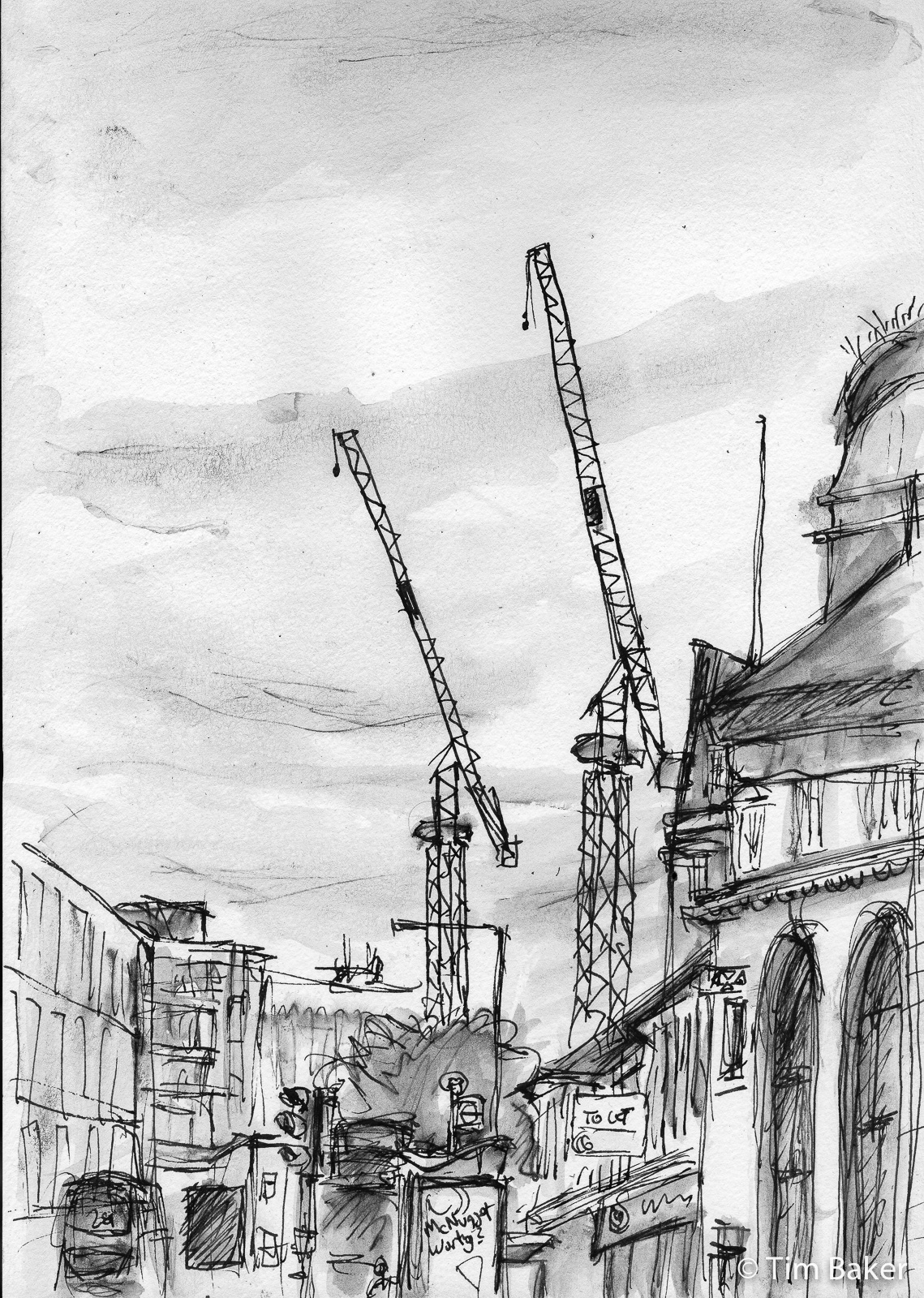
Time to talk of many things, of Cranes and Kings, you’ll have to answer to… Cranes of Kingston! Yes I have a thing about cranes they appear in many works, even are the featured star and recently the ones that tower over the horror that is Royal Exchange (yes they exchanged my former Job Centre for some equally horrible luxury flats! Come to think of it, that exactly a royal exchange…) These are no exception.
First one is the most recent, I don’t often draw in Kingston itself, thinking I’ll get hassled…but in fact sitting on the public benches looking up Eden Street towards the cranes, I wasn’t at all. You can see the bus sttops, buses and the route I usually take for my shopping! And err…a McNugget advert. That kind of sums up the delights Eden Street- building works, buses and McD’s (kebab shops not shown – well they are, one is under the To Let sign, just it’s not obviously a kebab shop).

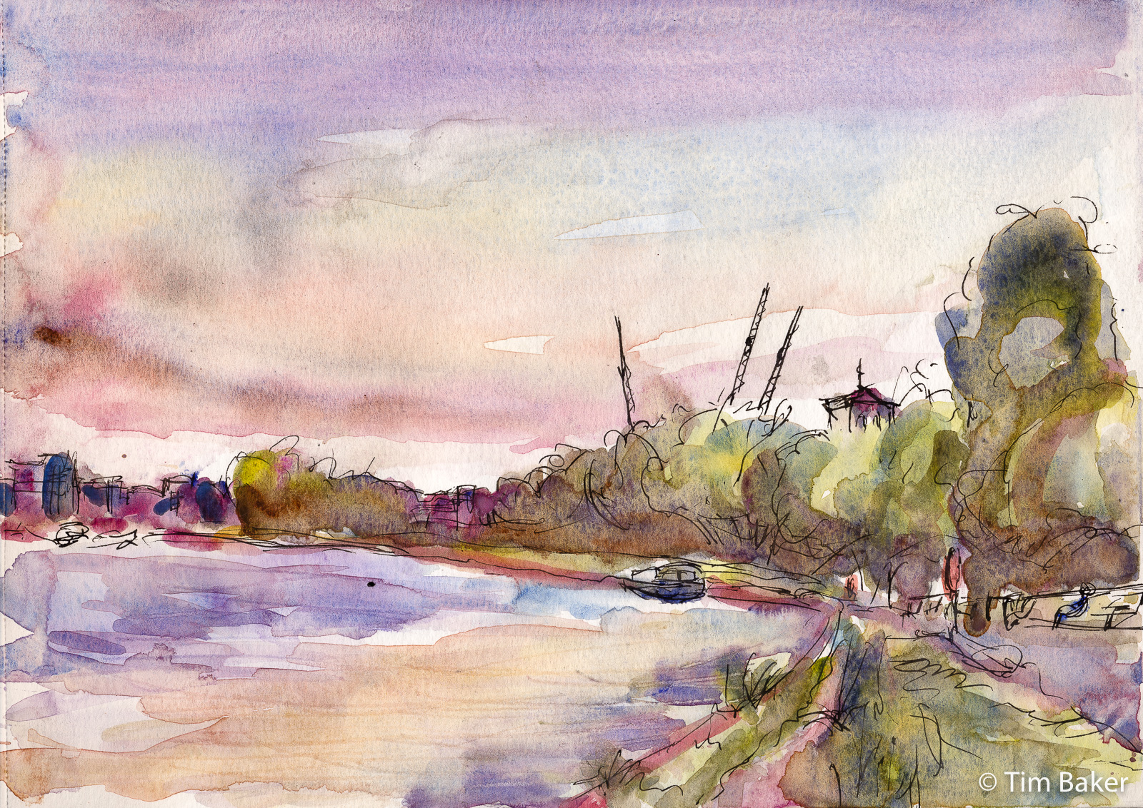
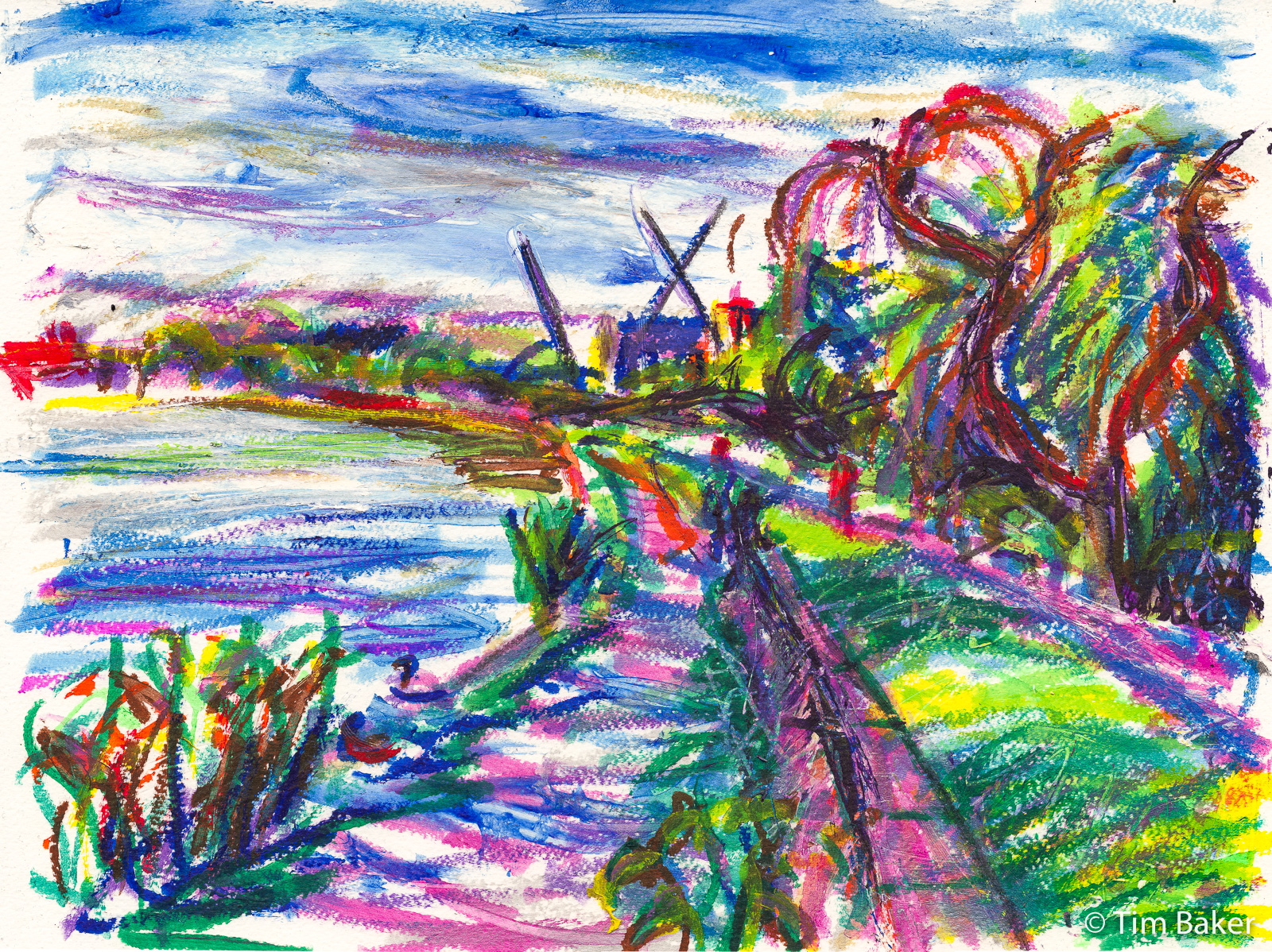
And along the river I did the same scene accidentally twice in as many weeks. It started with the paint stick piece, which actually took ages, despite it looking like a quick child’s scribble. I quite like it now, but back then I hated it. It wasn’t til I started to scan them that I realised I had duplicated the scene about a week later in watercolour and fountain pen! More of a sunset scene, but you get to see the movements of the distant cranes and the differences in media.
I like the looseness of the watercolour piece in the drawing and the sky work – my clouds are really coming on. Not so fond of the green parts – the risk of using Winsor Violet (Dioxazine) to tone down the greens, it has a high drying shift (technical term, basically it dries a lot lighter, that it seems when you first use it – not nature of it being ‘cheap’ cos it’s Winsor & Newton Professional Watercolour – more the nature of the pigment). So it means the shadows have lightened.
Trying to get the darker parts dark and not bright, but not muddy is the eternal struggle with watercolour, cos you can get it deeper yet still intense in in colour, or muted yet quite often lighter (tertiary mixing), or just darker but then it loses the ‘shine’ and gets all dull. Try and do two of those things will end up with it also looking muddy or opaque. This is why watercolour is hard.


And the first version was the paint stick piece – I rarely do landscape paint stick work, because it can sometimes really work but it usually does not. Here I think it does, I had real problems with the paint sticks though – two of them in storage *cough stored in a plastic bag on the floor* had gone really weird and gooey – like they had gotten damp.
I’ve now replaced them with others as they didn’t dry out even next to the dehumidifier for several days.
This is why this piece took on a more textural heavy feel, as the purple and light blue were just smearing on the page to had to finger paint, scratch and blend before they dried. I stupidly used some of the flouro green so this means this won’t be 100% lightfast, but did the old trick over covering that with stable yellow and green so if anything fades, should still be something there!


Leave a Comment! Be nice….