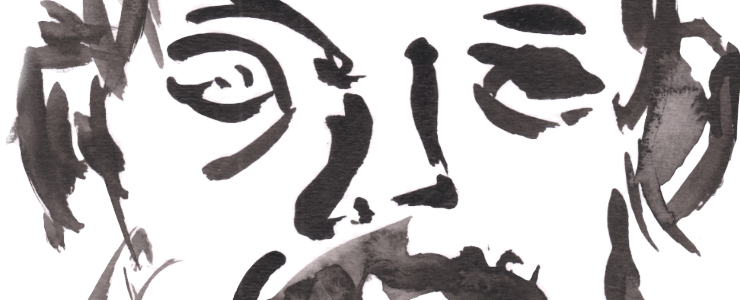


No Portraits At The Pub tonight, which gives me a chance to post this from two weeks ago of Jools and her other half Sean (or is it Shaun? Not sure). I had recently gotten the new/old rOtring Micronorm and Isograph and Faber Castell technical pens, so this was the first trial run of drawing with them – well before sunflowers. I wasn’t sure if they would work, but I had tried it out on a abstract doodle beforehand.

The verdict is yes – although not totally fond of the more manic lines and hatching. It’s a trait I used to have with fine liners like the Microns when I used them for life work. I shifted more to the measured lines of dip pen then fountain pens as a response to that chaos. It’s not wrong, it’s just not a style I love, although I do suspect it’s still the related fall-out of the ‘scratchy pencils’ critique.


I don’t know if I then need to embrace my ‘scratchy/manic’ inherent nature and say fuck you to those terrible art teachers, or fight it and keep with more defined lines? I can see benefits to both. I do like using the thinner more precise lines though, that I love. Although it feels at point more like a technical exercise, an architectural plotting…but in part it IS those things for me? For me it’s mostly drawing exercise in form, rather than some deep desire for portraiture (but getting a likeness and soul of the person is good too).
I think the best ones are the ones of Sean, and the first one of Jools in a similar pose. Not totally sure about the second Jools portrait with the wash. The star of the free watercolour makes me think I should go back to that style more, it’s really hit and miss, especially with the ever-changing disco lights making colour fidelity hard – but when it hits….

Leave a Comment! Be nice….