

The Night Work series continues with more paintings at dusk on the river – so much so I’ve named one YAS not so much after the cliched gay slang, it stands for ‘Yet Another Sunset’. Sadly because of time and when I get to go out, and the restrictions due to COVID-19 has meant more of these than I really wanted. I love the reflections, but really want to paint and draw other things, but I am stuck with what I have on my doorstep. Better than many people, and I love how the river looks at night, but enough!

But I think ‘Ghost Ship #3’ above is a good addition to this series, I’m trying to use my Khadi 100% cotton paper more. It’s really difficult to work with, cos it spreads so much – and masking fluid tends to adhere to it too well. Keeping the swan sort-of white was a task in itself, defending it from the floods of spreading watercolour!
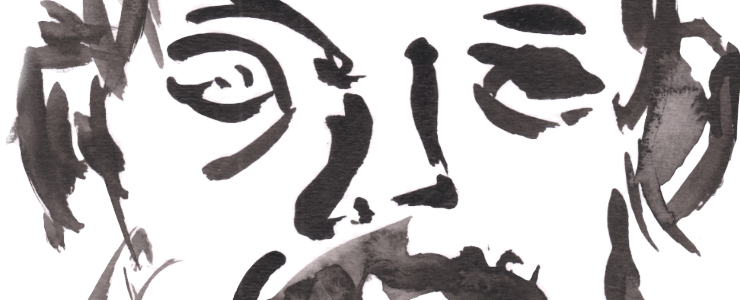
I’ve diversified into other night subjects – this one really belongs in the next Richmond Park post but I’ve not been back for a while, I am waiting for later warmer nights or for me to wake up earlier (the stress of this pandemic affects my sleep cycles greatly, hence so many night/sunset pieces) whichever comes earlier. This is actually King’s Standing, the long barrow in Richmond Park. It’s based off a waking dream I had (a vision sounds preposterous, but that’s what it was) of people – ghosts? ancestors? shadows? standing on the long barrows.
I guess prompted by the name but there was more to this waking dream which I will feature in other works, I will come back to this – this was rushed because it was going dark – hence the moon, and I even used a stick to draw but I feel I didn’t do it or my vision justice.

And lastly just sitting in the garden on the inflatable sofa drawing in the dusk I created ‘In The Night Garden’. A very loose fountain pen drawing, one I really enjoyed doing, with watercolour using some new watercolours.
After the ‘yellow experiment’ and then trying various Cadmiums, I’ve been experimenting with different brands of blues – Ultramarines and Cobalts to be exact. This is because Winsor & Newton Professional Watercolour is now so expensive and the usual Spring sales haven’t happened. So not wanting to spend an eye-watering £21 plus postage for a 37ml tube, I have been buying smaller tubes of different makes. Ultramarine, like Burnt Sienna – another colour I have been diversifying with cheaper makes – is used a lot for shadows, so of all the colours apart from yellow it gets used a lot more.

Lukas 1862 Ultramarine Deep was the first I tried, it is pretty good for mixes but chalky/flat when used alone. This piece uses the second brand I tried, Ken Bromley’s own make and St Petersburg White Nights Cobalt Azure Blue. Again I found that the KB is chalky on it’s own, like the Lukas it has nice granulation but I think I’ll keep this small tube in reserve for when I’m out. You can see this chalkiness at the bottom of the sky…also the cheaper makes although using the same PB29 pigment seem to be more of a bright blue rather than the deeper blue I am used to. I am always choosing the ‘deep’ version if there is one, but it still is quite mid-range.
Like White Nights, KB’s watercolour really feels more like a better student grade, like a slightly better Cotman. I have White Nights Ultramarine to try next, as well as Rembrandt and Jackson’s own make. But the preliminary results seem to suggest that the main brands (Daniel Smith, Sennelier, W&N, Lukas, Rembrandt etc) – and Jackson’s which is most likely made by Sennelier although there are some differences – are best. The cheaper makes tend to be OK in mixes but look flat on their own or shift/lighten a lot when drying (White Nights was bad for this with the Cobalt Azure, sadly). Lukas Cobalts like their Cadmiums are well worth it – as is Jackson’s Cobalts but it’s mostly binder so not sure how much cheaper it is.
As an aside, Jackson’s Cadmium Red/Yellow/Orange are also really worth it – unlike their Cobalt it isn’t mostly binder, and work well. Cadmiums seem to dry ‘chalky’ even with Sennelier if you use them too heavily, so I guess that’s not a problem. They are great in washes though, especially Cad Orange. Again they lighten/dull a lot, but that happens even with the main brand Cads. So save your money and get a Lukas or Jackson’s Cadmium or Cobalt.
Leave a Comment! Be nice….