Continuing with the Night series as the nights get warm it’s plenty of opportunity to work outside the usual daytime views which I am very tired of at the moment. First up is ‘In The Night (Midnight On The River)’ – named after the Pet Shop Boys song, but the subtitle is indeed true – left at 11pm and didn’t get back til 1am! It is very abstract and again experimenting with different blues – cobalt, ultramarine, cobalt azure – and the Khadi paper. Talking of which this looked stunning until it dried and then lost a lot of the deepness, partly the paper, but as explained in the last post, partly the pigments. Fail for White Nights and Ken Bromley…
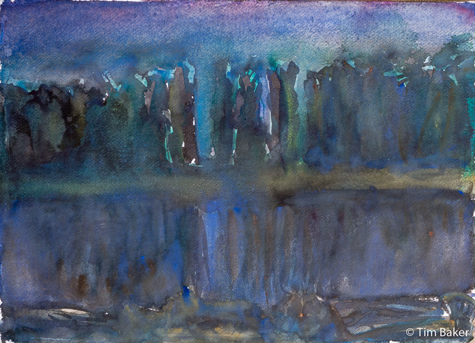
That said I like the fever-dream feeling, the abstract ‘Gursky’ nature and the trees seem to double focus like there are multiple lights shining among them, and the yellow ochre/cad yellow of the bank. The raw umber/browns of the river. And the barge melting into the water/shadows at the bottom. But again, Khadi paper is a struggle – and the Lukas Ultramarine left chalky bits when it didn’t mix.
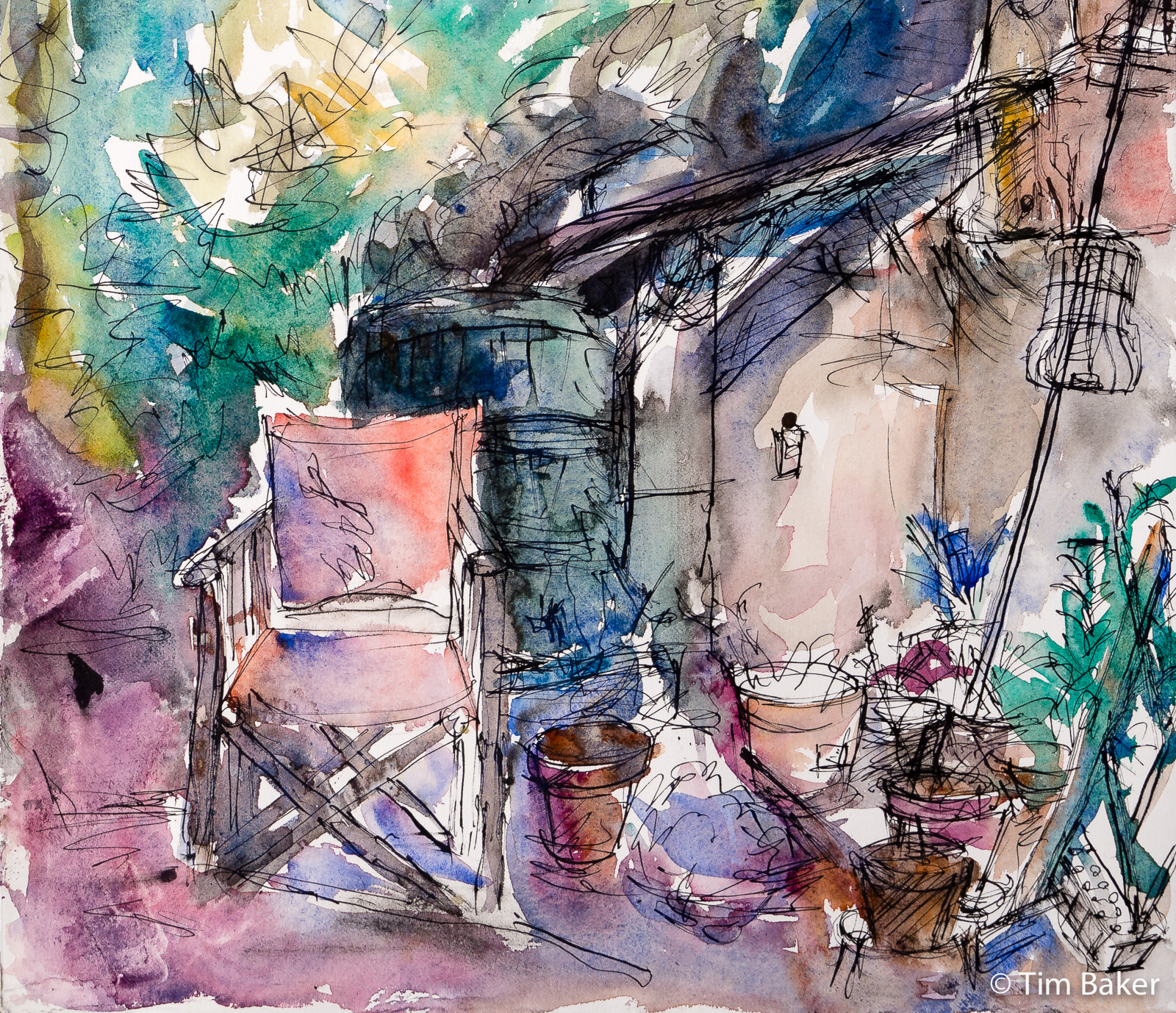
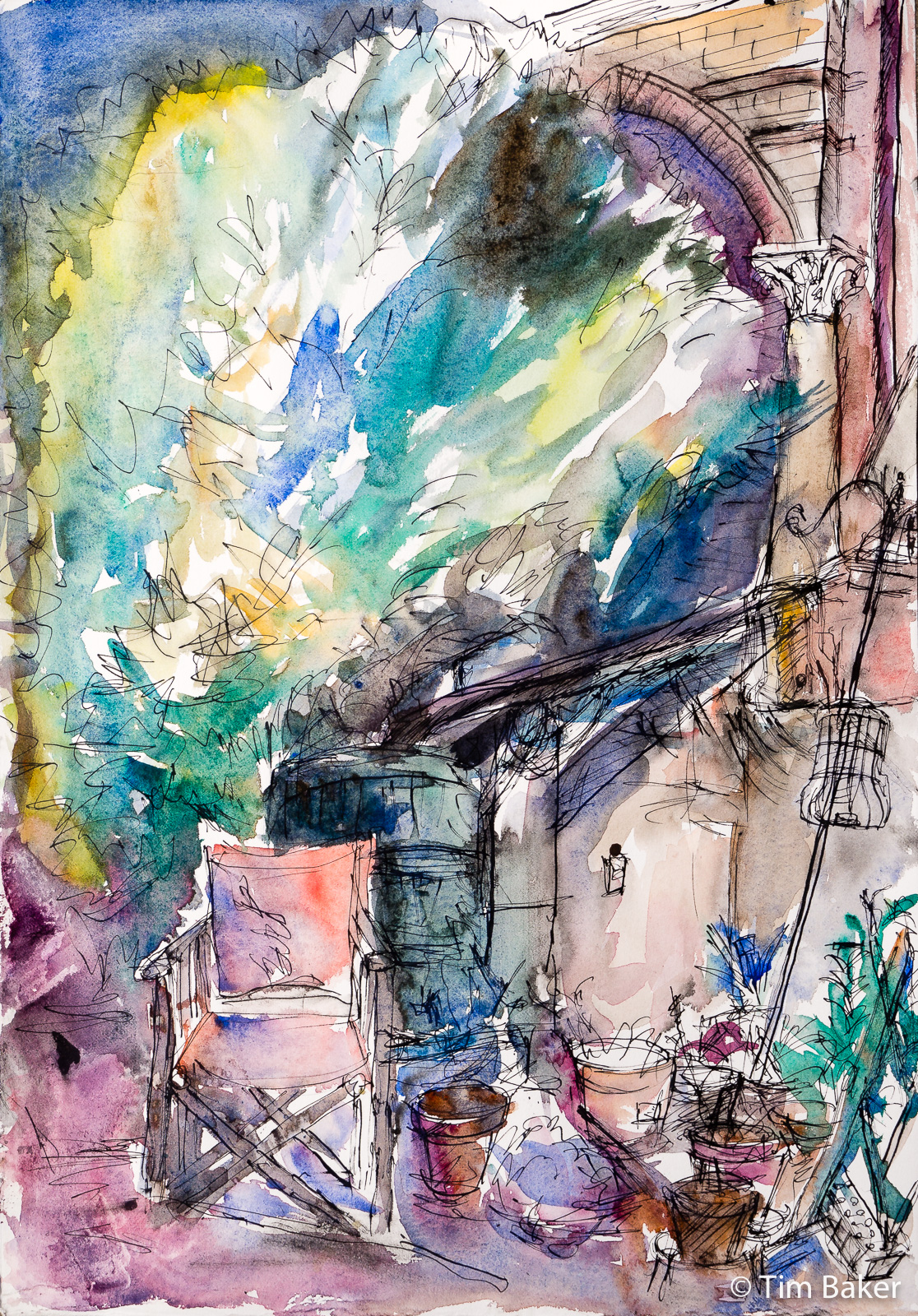
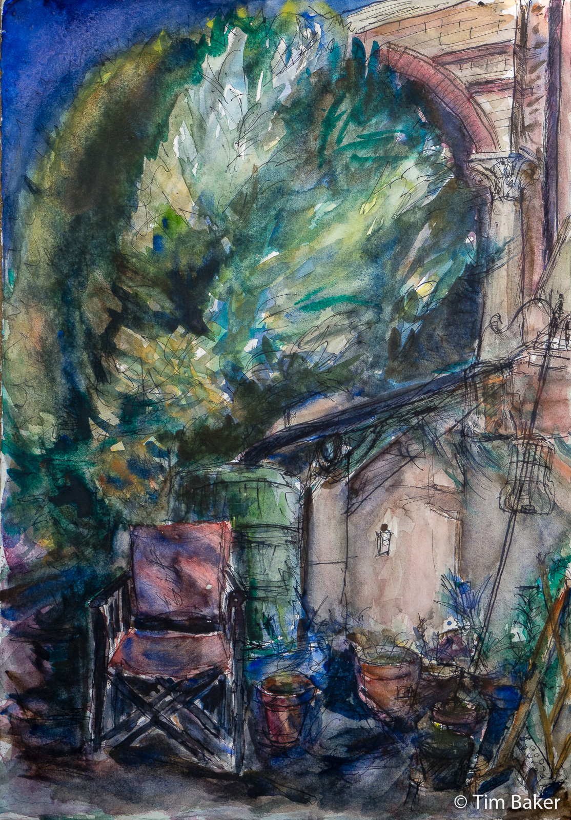
Then we have a sequel to ‘In The Night Garden’ – and as a friend used to say, sequels are so disappointing aren’t they? Well, I was proud of this one in the first iteration but felt it was way too light – it was like Day for Night, but a certain person shut off the light I was trying to see by before I finished. I loved the loose drawing though, like the first one it’s very lyrical.
So I went back and made it closer to how it is at night, but now feel it’s too dark? Part of the solution to the above problem of light-drying blues (literally and figuratively) was I was using a much better and darker Ultramarine made by Rembrandt. Highly recommended, a dark deep blue in the vein of Winsor and Newton’s Ultramarine but slightly cheaper here.
It worked much better – but of course I am now used to piling on s much blue to get any sort of faint darkness, I used too much. Admittedly at night when I can’t see as well wasn’t really a good time to try it.
I did reflect that I really am trying to do something with watercolour that it isn’t meant to do, and using it in a way that is more like gouache. Maybe I should try gouache again, but like acrylics I never totally was happy with that dead-looking flat matte finish. I love the light you can get with oils and watercolour because of their translucency. Maybe I should try black watercolour paper or black watercolour surface medium (a bit like gesso for watercolour) – they both exist!


Leave a Comment! Be nice….