I am fond of Prussian Blue, I mean really fond of it, and for a while totally obsessed with it’s dark greeny-blue nature and it’s properties, which I’ll talk about later. It was the first modren synthetic pigment, created back in the 18th Century from dried blood (ugh) and is made from oxidised iron salts. It’s a really weird pigment derived from iron that is the only one to fade and then come back after being stored in the dark, and a lack of oxygen can also make it fade. That doesn’t always happen according to studies – once it starts it will never come back as much as it did before. So really it is fugitive and it’s really only for sketchbook work, although modern variants cope better with UV. It got it’s name because the colour was used to dye the uniforms of the Prussian army.
Some will tell you to use Pthalo instead – and I hope you look at those people like they are crazy – because as I found working with them side by side, Pthalo Blue, Indanthrene, Cobalt Blues and French Ultramarine do not act in any way like Prussian Blue. The lovely mysterious dark shades made by pure Prussian Blue, especially mixed with purples are not replicated anywhere else. That’s why I got obsessed. Also not to go all David Icke, turquoise is one of my favourite colours *of all time*, and in washes, it’s very turquoise.
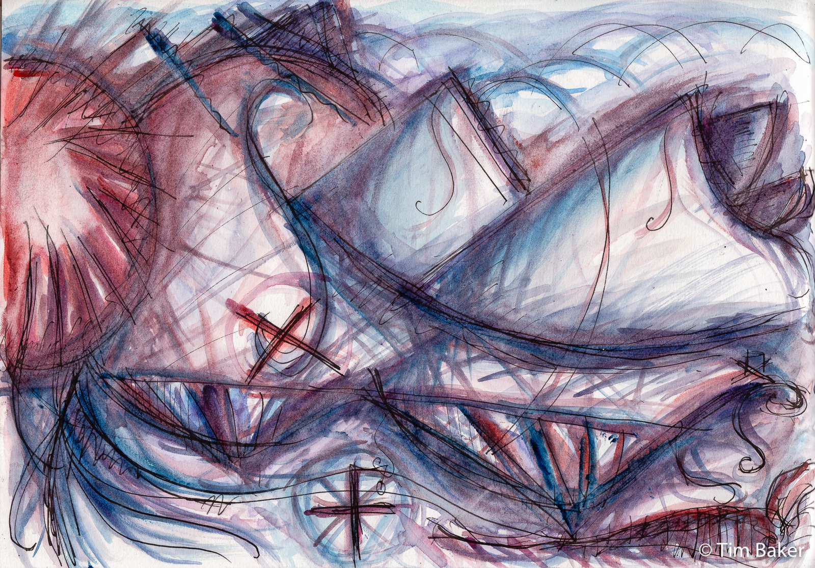
So starting at the beginning was a piece that’s actually part of a series of Lockdown abstracts I’ve not really posted yet – but looking back I could see this is where it started. The piece is an abstract landscape called ‘Don’t Stare At The Sun’ after the haunting psychedelic Richard Hawley track I was listening to, especially the MAGNA live version.
The lyrics and video about isolation says the last 6 months better than I ever could:
If I could see it all
All to be lost, in the galaxy of distant stars
Did I see your face?
It weighs so much, to be alone tonight
Prussian Blue came into my life through having some in a Winsor and Newton Watercolour Stick – now you can see from my back catalogue I used to use these more, and struggled with them, the NeoColor IIs and the Inktense blocks as crayons, I did not get on with that. Turns out they are perfect for travel watercolour – i.e. filling watercolour pans if you cut them up. I did that with the sticks I had around the time of Brexit/Chinese shipping crisis causing paint supply issues, especially French Ultramarine from W&N suddenly getting weirdly scarce in the bigger tubes. I found the sticks unlike the usual gloopy Yellow Ochre keep their shape better even after being wet, so I will continue to do this for a few of my colours.
Other colours that came (back) into my repetoire via this are Winsor Violet, Dioxazine Purple, Indian Red and Cerulean Blue – now I have variants via Rembrandt of those colours in my palette. Also a return to using the very useful Winsor Yellow via the sticks. I stopped because of the lack of regular sales in W&N in 2020 meant other brands were cheaper. Annoyingly there January sales in W&N – but sod’s law, the colours I wanted weren’t in stock!
Reason I mention the sticks is that the painting above was done purely with this reduced ‘stick’ palette of new/old colours. There was even a Cad Red Hue, a sort of orange red, which despite being a not a single pigment, I really like. This started the idea of restricting my palette sometimes, focusing on a colour or a few colours to create harmony.

The start of this series proper was this work – still including the multifaceted crystalline structures of old (I really have no idea what they are about yet), spirals and swirls. The prohibition symbols remain – what I call the hatted cross, like a sort of warning symbol, and a new variant, the triangle cross. An abstract landscape of a new fractured world.

Then I think this was the second, certainly second I posted and I posted them in order – the name comes from John who was obsessed with Kyklops – said kiklops not sy-clops like the modern translation (cyclops). He saw the big circle and said ‘that’s Kyklops’ so the name remained. Arrows, spirals, circles, check – but you can see what I meant about those blue black deep ‘darks’ of pure Prussian Blue? I think here I started to mix with the Winsor Violets and the Rembrandt Manganese Purple.
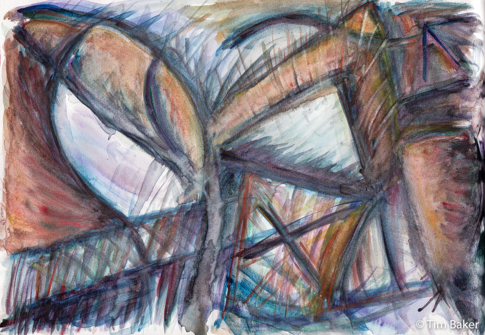
Goiânia comes out of my research with Prussian Blue – did you also know it’s also a medicine? It’s used to treat heavy metal and radioactive isotopes of caesium, and the most famous case of the latter was the 1987 Goiânia incident in Brazil where a disused treatment machine was stolen, opened and made hundreds radioactive (and killed 4). Prussian Blue was used to treat thousands for possible radiation poisoning. Also those who opened the canister containing the radioactive material talked about a blue glow, this has also been talked about in Chernobyl and other nuclear disasters, and the dust – radioactive caesium chloride – also had a blue glow.
I tried to show that in this work, that glowing, with of course the warning symbol, the triangle hatted cross again.

More serene is The Pool where I was exploring lines, angles and water forms. It seemed very calming and nautical after the last piece, hence the name. Sometimes art can be a place of serene calm, rare in my work but it is there. Also I spot the clock shape, which features in the Clocktower abstract. And flags, moons, spinning tops and the less angry warning sign, the diagonal lined circle, which isn’t totally a prohibition. (Sometimes it’s planets and orbits or just closed paths, not as full on as the hazard symbols above, and definitely less serious than the crossed out circle). The lack of crosses in fact make for a calmer picture. You see there are meanings if you look!
Then I decided to go more freestyle and explore the differences in the different blues and purples, side by side. I think by this point the new tube versions of the pigments I loved from the sticks had arrived, so I wanted to play with those:

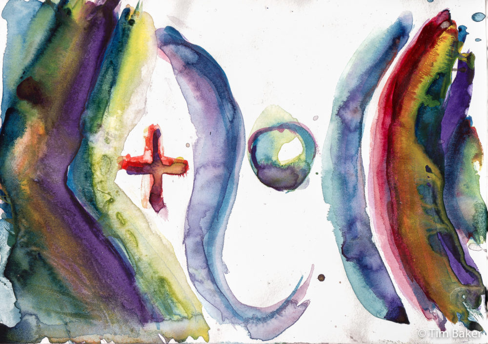

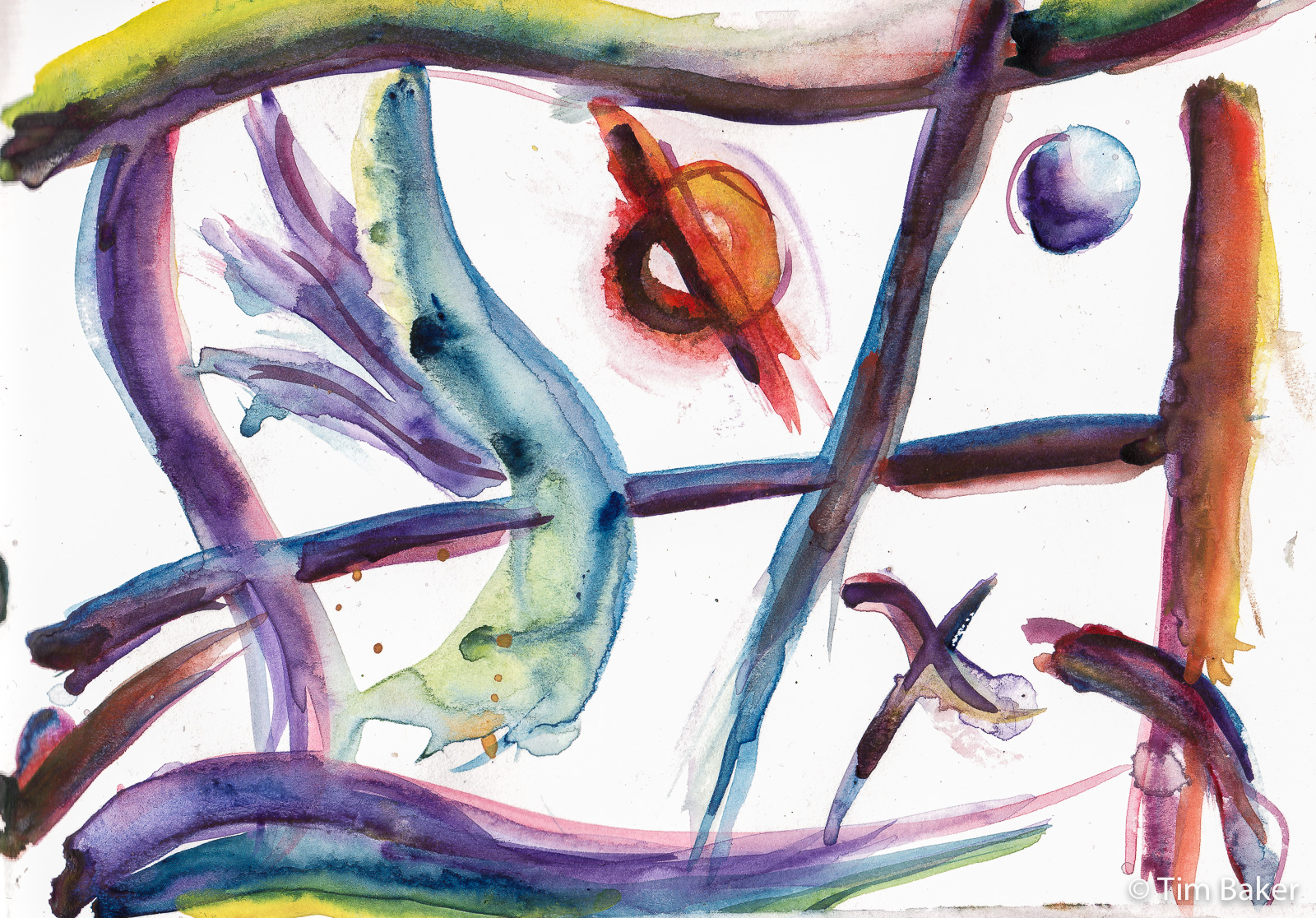
You can see more with the lower two, as I put manganese and diox purples, blues, cobalt violets and perm alizarin crimson and cadmiums together how the different colours interacted with the Prussian Blue. I like the almost metallic tectures and irridensence you can get from combining the blue/greens with light purples and yellows. And bring them out by contrasting those with oranges and yellows as well. A lot of colour theory in action too!
This very much was an experiment in colour, although almost mathematical formulae and planets come out of the void, and fluid fabric like shapes. I felt the darkness of the earlier work had lifted, it was telling how in the lockdown my abstracts got blacker and blacker, like how I was feeling, and some of these pieces follow that.
I hope this makes sense, I’m always reticent to post my abstracts (apart from when there is nothing else to post) as they are an experiment in techniques, meaning, symbology and subconciousness – and I don’t really have the answers yet as it’s an ongoing process. So showing them makes me feel uneasy – probably more than I should be.


Leave a Comment! Be nice….